In this document:
What is a Page Layout?
Papyrs pages are by default split into two parts: a main area for the content of the page and a sidebar to the right for navigation. Although this is ideal for many pages, sometimes a different page layout suits your page much better. With the Page Layout editor you can create almost any page layout for your Papyrs pages with just a few clicks.Here is a quick 2 minute introduction to the page layout editor:
What sort of page layouts can I create?
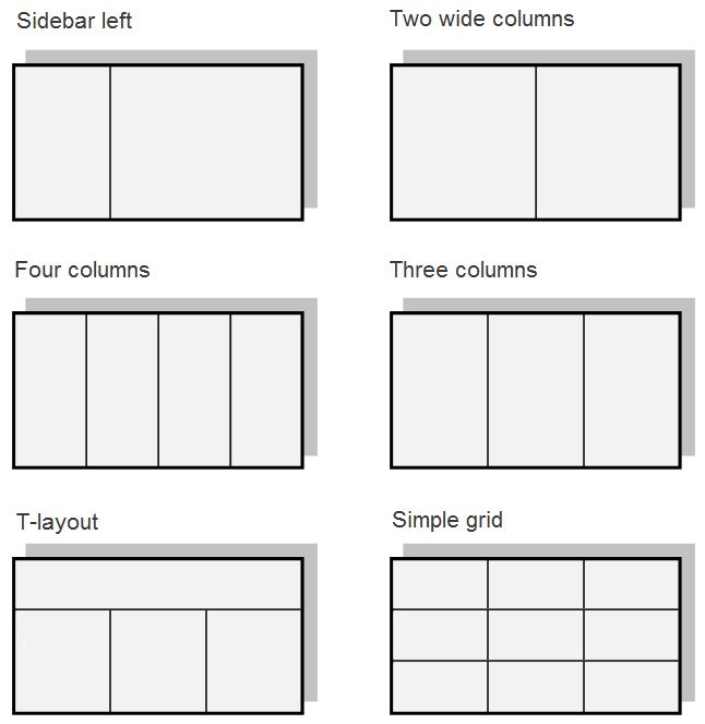
The possibilities are endless. To give you some ideas, here are some popular page layout choices:
The "Wide columns" layout is convenient when you want text and discussions about the text side by side. The four and three column layouts are great to break up lots of text. The T-layout is great for the homepage: with navigation on the top and news and information widgets in the three columns underneath. The grid layout is great for a dashboard/overview page, where you can look at everything that's going on in your organization at a glance.
You can also create more complex layouts for your pages if you like:

Although in the examples above pages are split up in at most 3 vertical sections, Papyrs has no such limit. You can extend your layout with as many page sections as you need (see below).
Where do I find the layout editor?
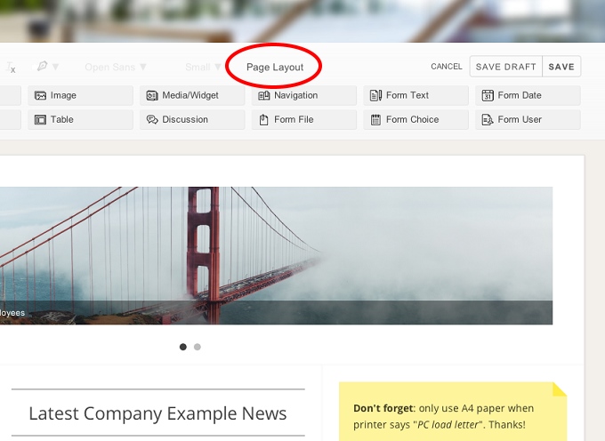
First start editing the page you're on (see: Editing a page). Then click on Page Layout to open the layout editor. See the following screenshot:

The layout editor will pop up.
How does the Layout Editor work?
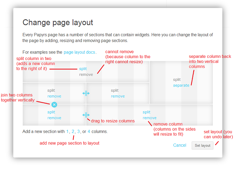
Here's a cheat-sheet that explains what all the buttons and links are for:
Changing colors
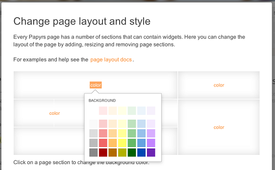
Different sections of the layout can be given different background colors. Changing colors of a layout section is easy: each section shows a color link. Click it, and a color picker is shown to change the background color of this section.

